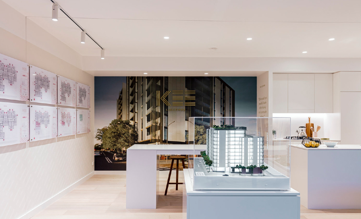
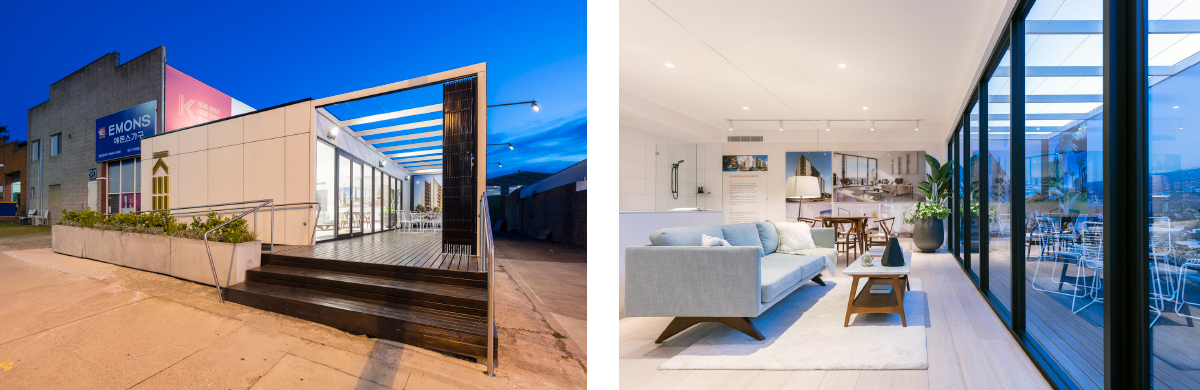
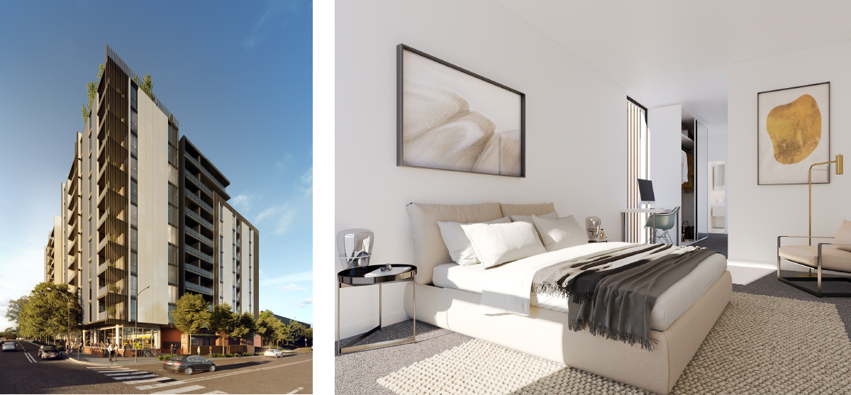
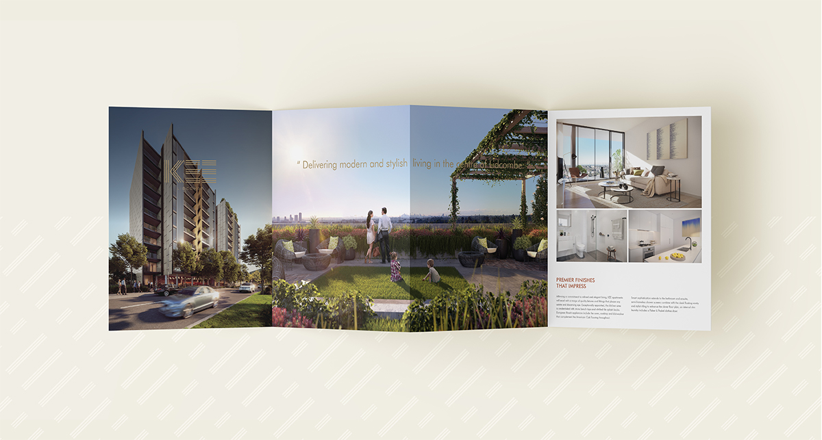
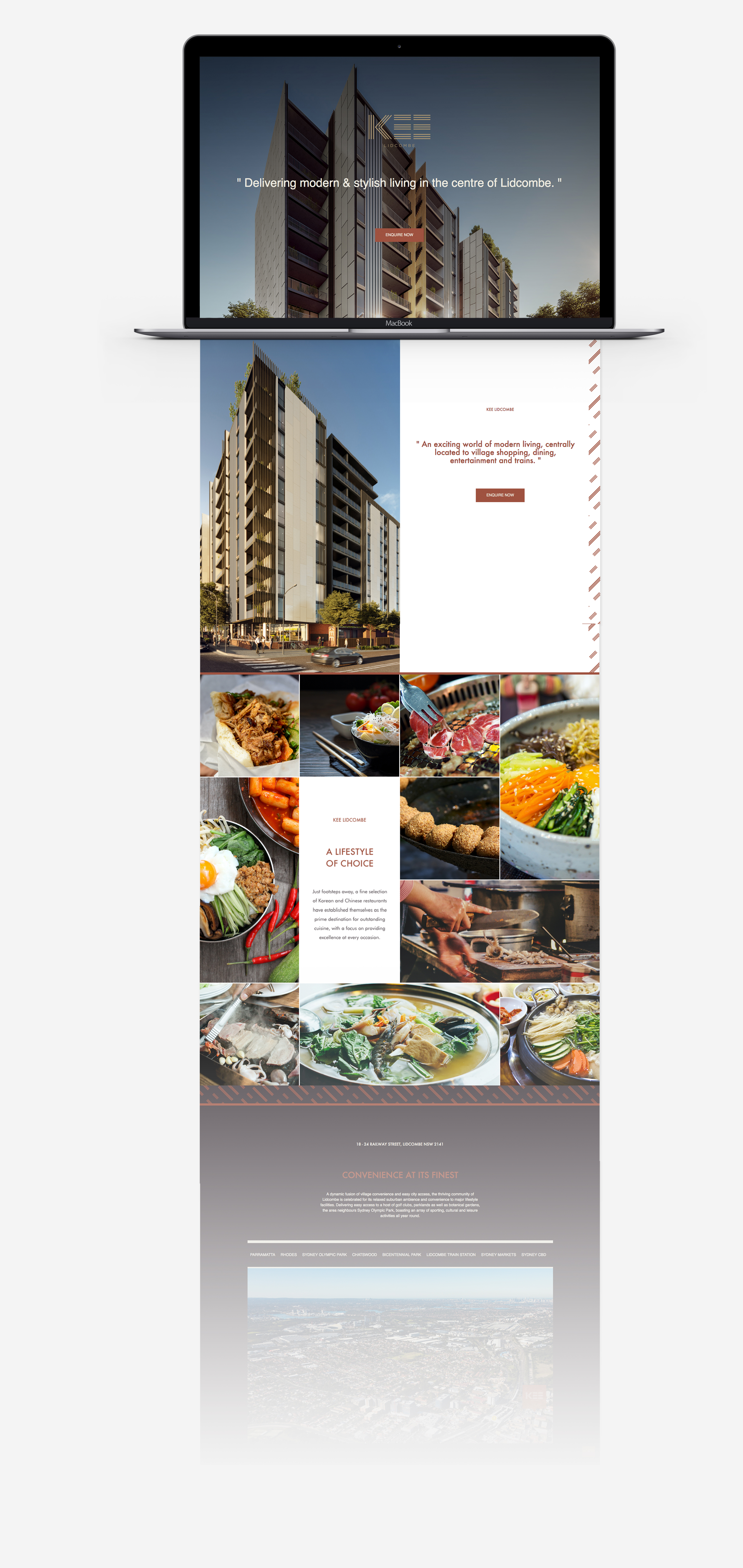
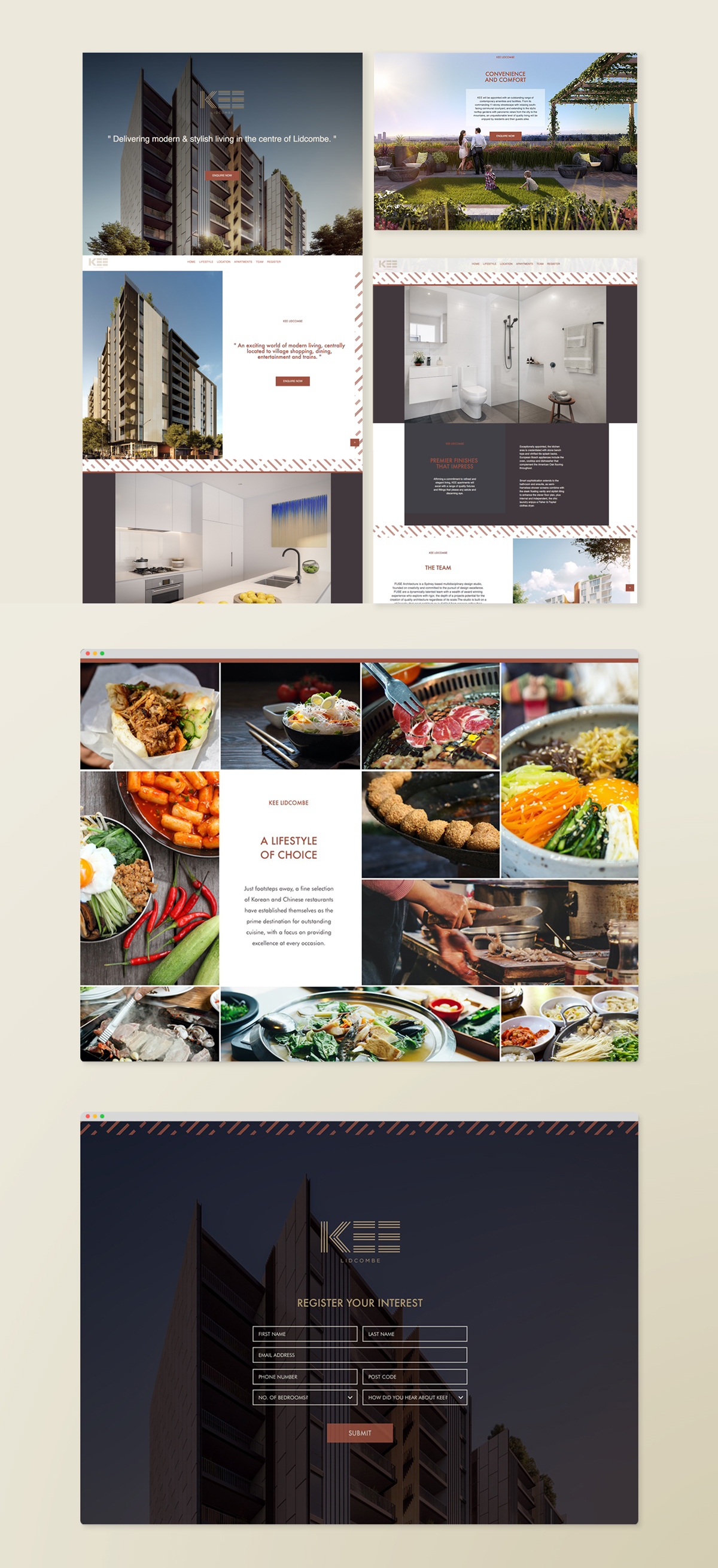
We were engaged to develop a brand identity that instilled confidence in Piety THP’s newest project: an 11-storey residential and commercial development in Lidcombe. At the time, this Western Sydney suburb was plagued by negative publicity around poor quality developments and the embarrassing antics of local councilmen.
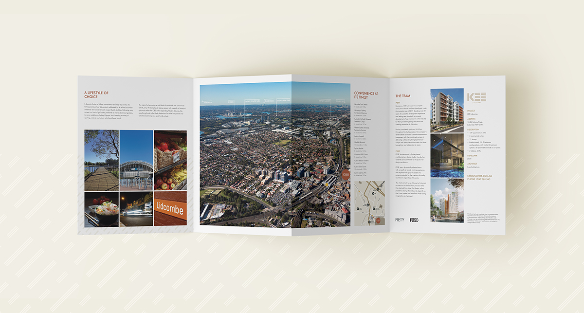
To shape our go-to-market strategy, we sought creative inspiration from our target market: a fusion of Lidcombe’s Korean and Chinese community. We struck upon the insight that this well-educated demographic are highly aspirational, and work hard in order to afford a comfortable lifestyle for themselves. From here we built an opulent brand story to inspire and excite our target audience, which harmoniously threaded all communications together and cut through the crowded property market.